
The Challenge
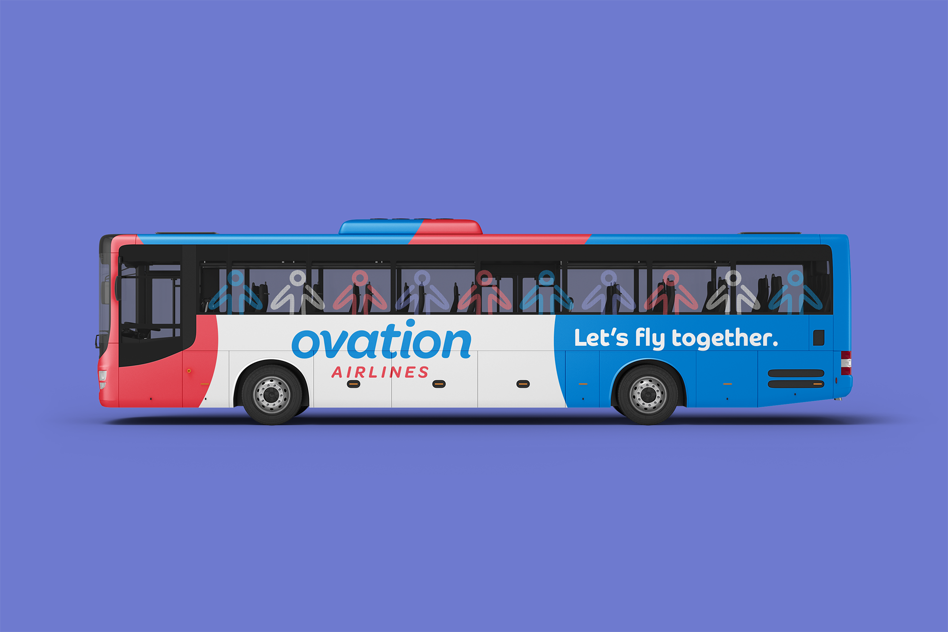
The majority of airlines cram as many seats as possible into each of their planes, and then force a class system onto passengers, where if you want to be treated like a human and not cargo, you’ve got to pay a premium. Ovation Airlines would do away with this class system in air travel, and needed a brand identity that demonstrates that they value all travelers equally.

The Solution
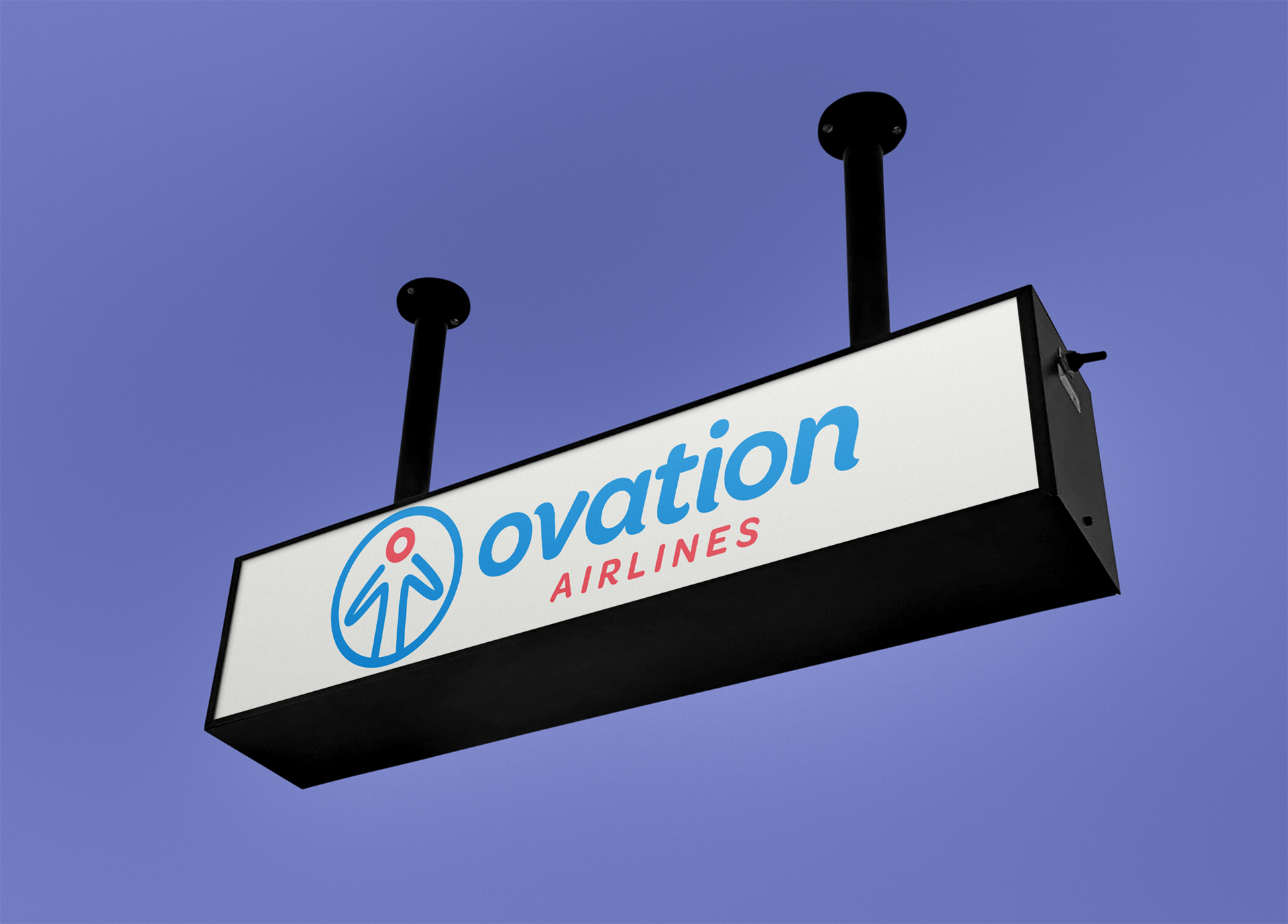
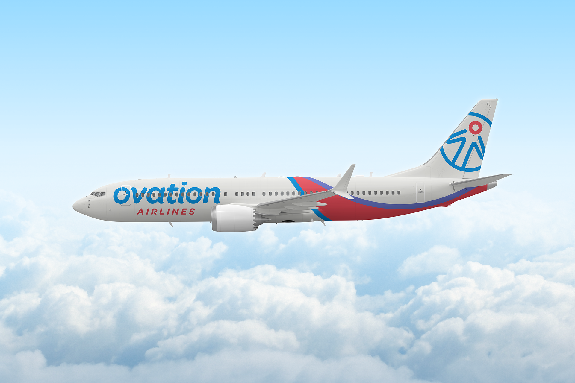
It’s a person! It’s a plane! No… it’s the Ovation Airlines logo!
In order to show that this airline puts its customers front and center, I developed a logo that depicts a human form about to take flight. With arms like wings, you might also see a plane when you look at it, or you might see an arrow pointing to your destination. Beyond the logo, soft curves, clean lines, and a color palette inspired by the view of a sunset from an airplane window all combine to create an identity that is welcoming, vibrant, and honest.